


")


browse previous posts:
Curious how font hierarchy works and why you need it on your Showit Website?
Read on… 👇🏼👇🏼👇🏼
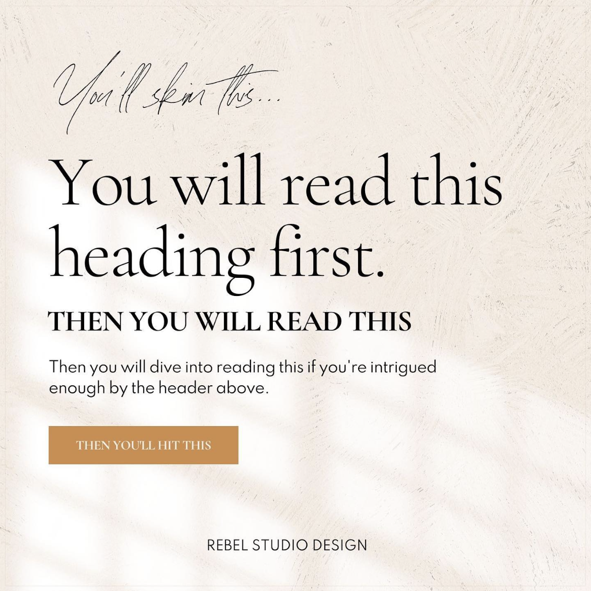
Font Hierarchy is a system for organizing type that establishes an order of importance within the content which allows the reader to easily find what they are looking for.
Basically, having different fonts and sizes of type increases the chance you will get your point across.
One of the biggest mistakes that I see on websites is sites not having a clear font hierarchy on your photography website. Your potential clients aren’t thinking this but they’re probably getting confused and confusion does NOT equal paying clients.
Here are some tips to improve readability –
⋒ Have a very clear and easy-to-read heading font
⋒ For your subheading font, simply use your body text font in uppercase or slanted.
⋒ Make sure the body text is big enough size for older adults to read. I stay around 12-16px. Keep in mind that different fonts may require different sizing.
⋒ Have a script font? Use that sparingly as an accent to call out fun words. I always suggest using a sans serif or serif font for headings, not a script font. If you do use script DO NOT create spacing between letters. The script was meant to look like handwriting and spacing between letters is a huge no-no.
Test things out – send your website to a handful of people of different ages and see what they think. Was there any confusion? Could they easily browse from one section to the next? Websites like hotjar will track client experience and can be hugely beneficial to assess if your font styles are working for you or not.
Overwhelmed by the idea of font hierarchy and just ready for a professional to take the reins on your new Showit Website? Comment below or shoot me an email!


